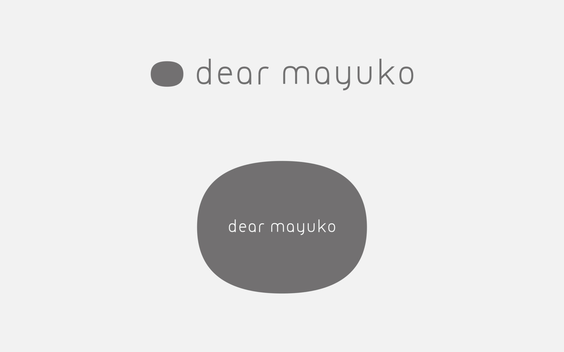
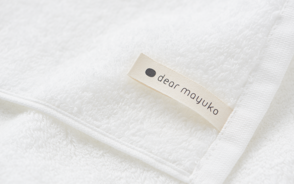
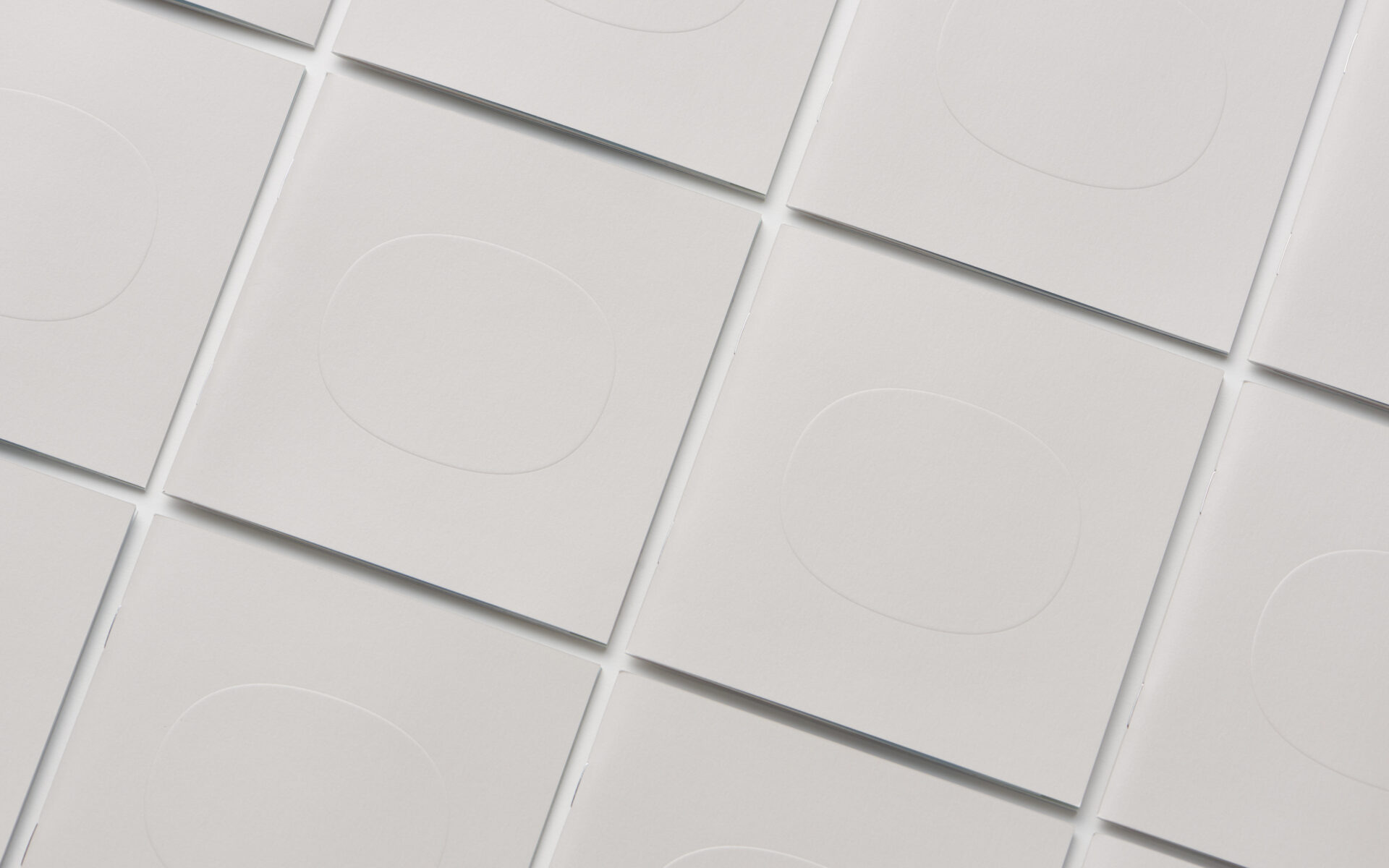
Logo and Mark
The logo derives from the circular form of the silkworm cocoon. This characteristic oval shape is applied to the tag, signage, and packaging designs, as well.
ロゴ&マーク
ロゴマークは”まゆ”のかたちをモチーフにしています。この特徴的な楕円形の形は、タグやサインや商品の形状にまで連動しています。
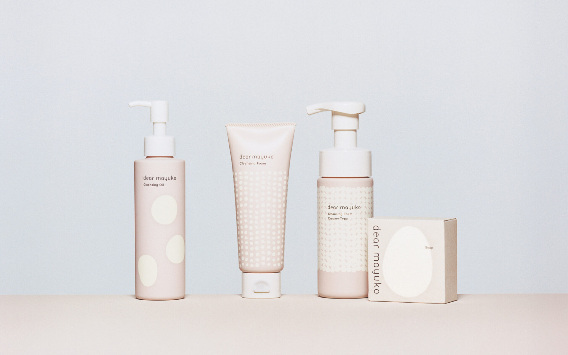
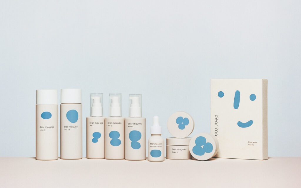
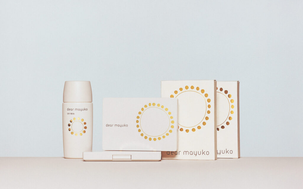
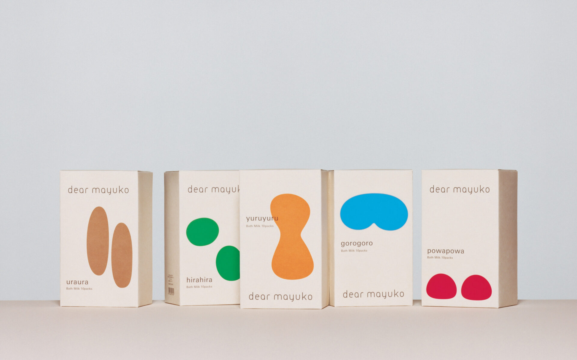
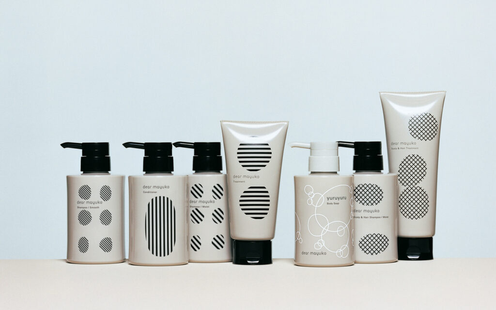
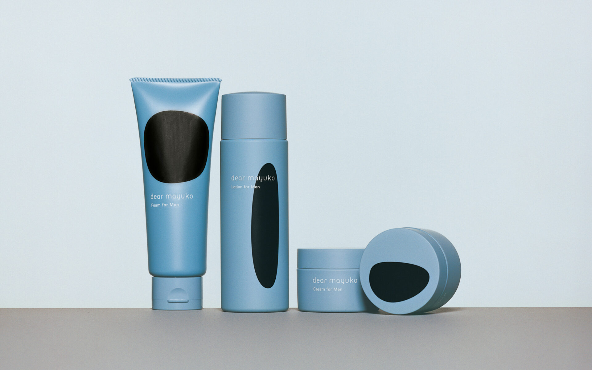
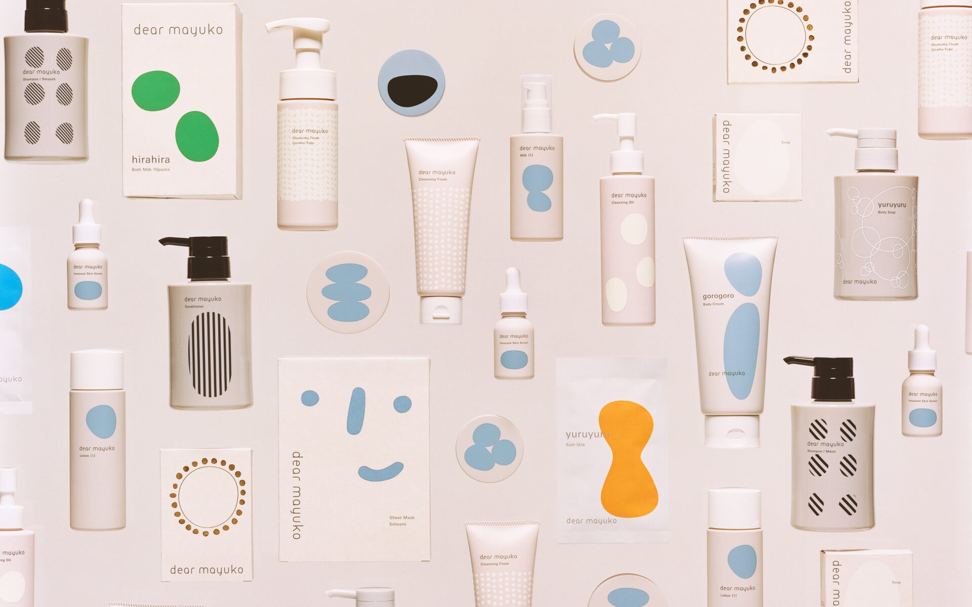
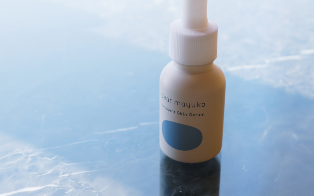
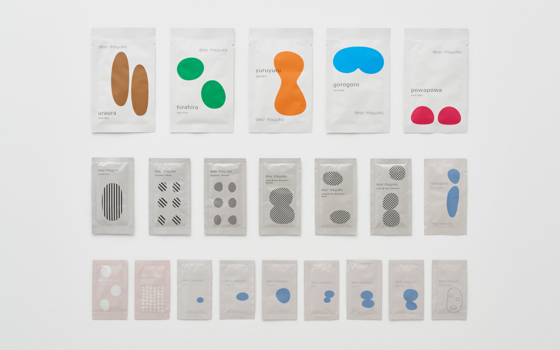
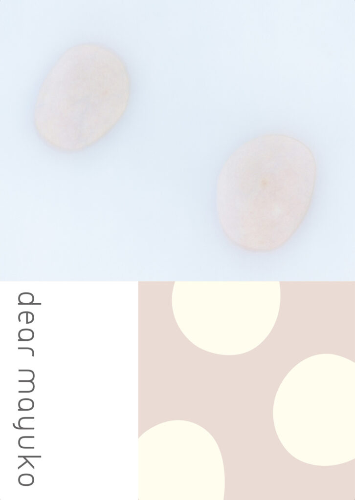
Packaging Design
Sensations evocative of Dear Mayuko shampoos and face washes— fluffy, bubbly, silky, glossy— are portrayed with various rounded shapes derived from the circular form of the silkworm cocoon.
パッケージデザイン
繭の“まる”をモチーフとして活用し、ふわふわ、ぶくぶく、つるつる、さらさらといった、洗顔フォームやシャンプーの使用感がもたらす気持ちを、多様な“まる”で見立てて視覚化。それぞれパッケージに展開しました。
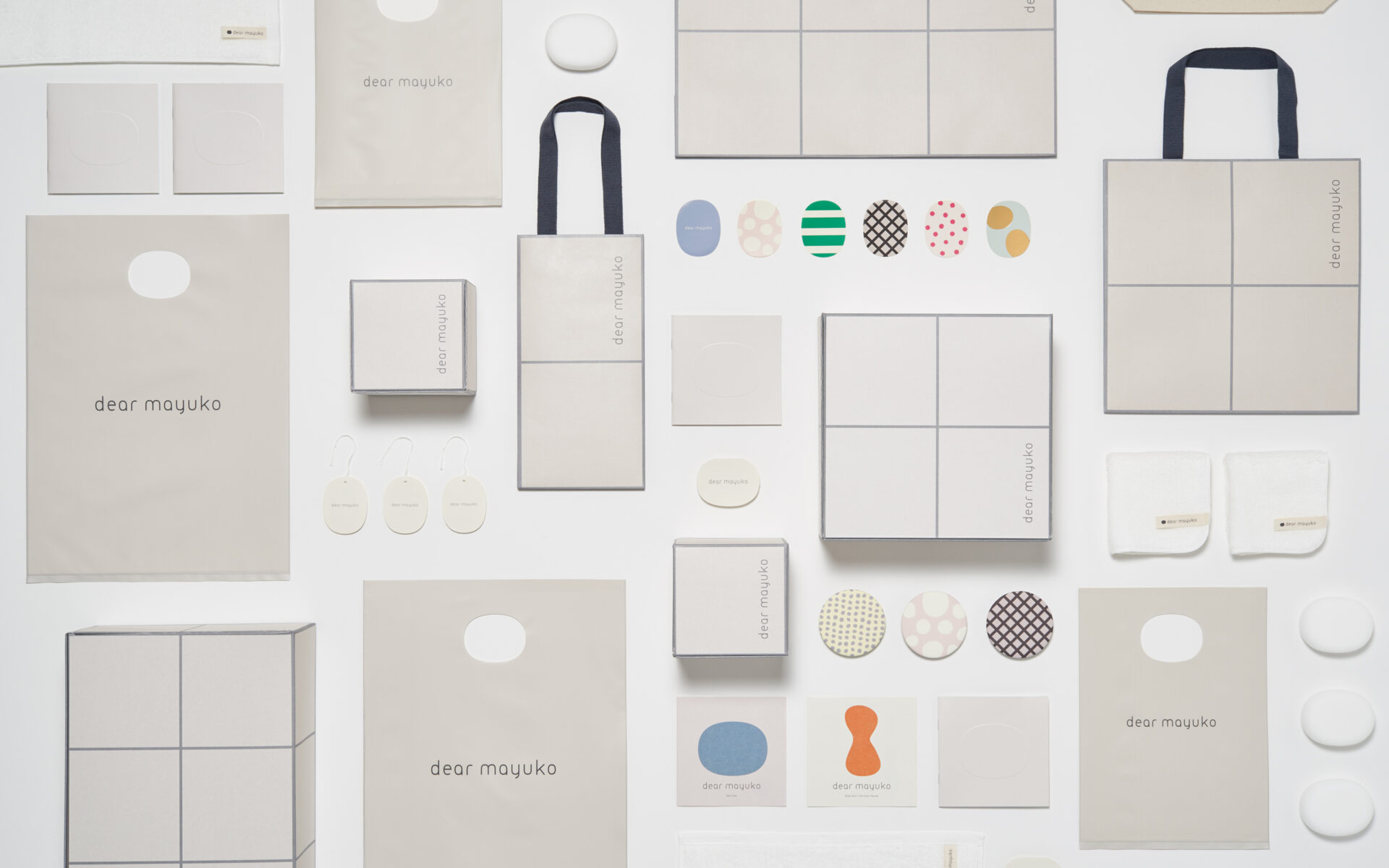
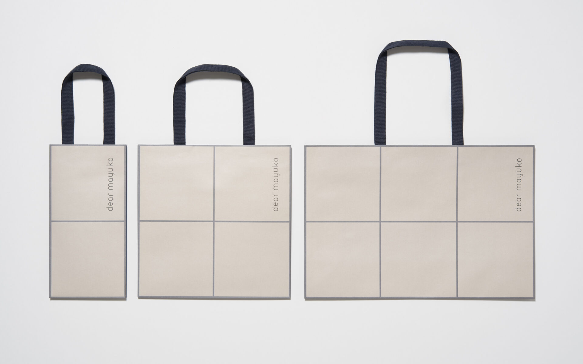
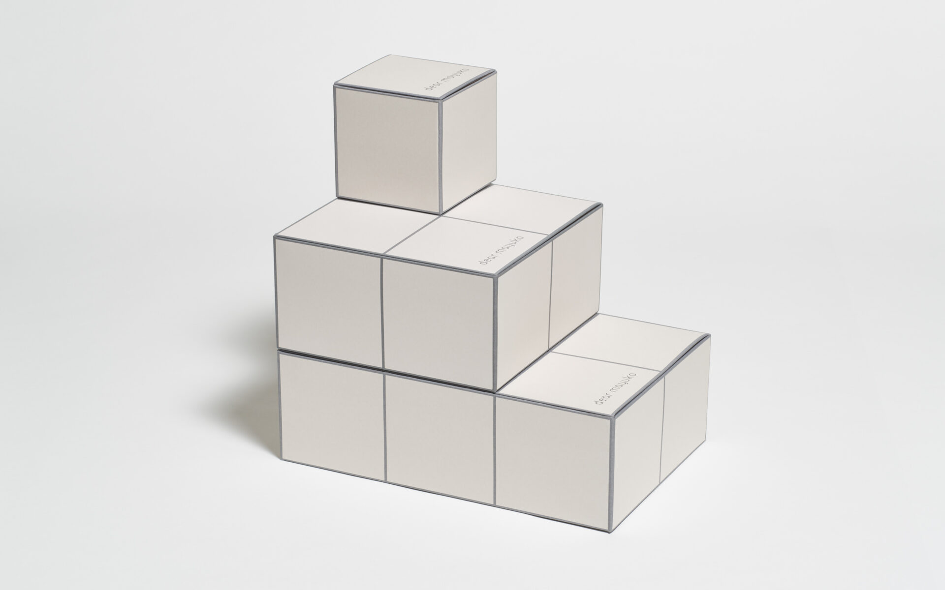
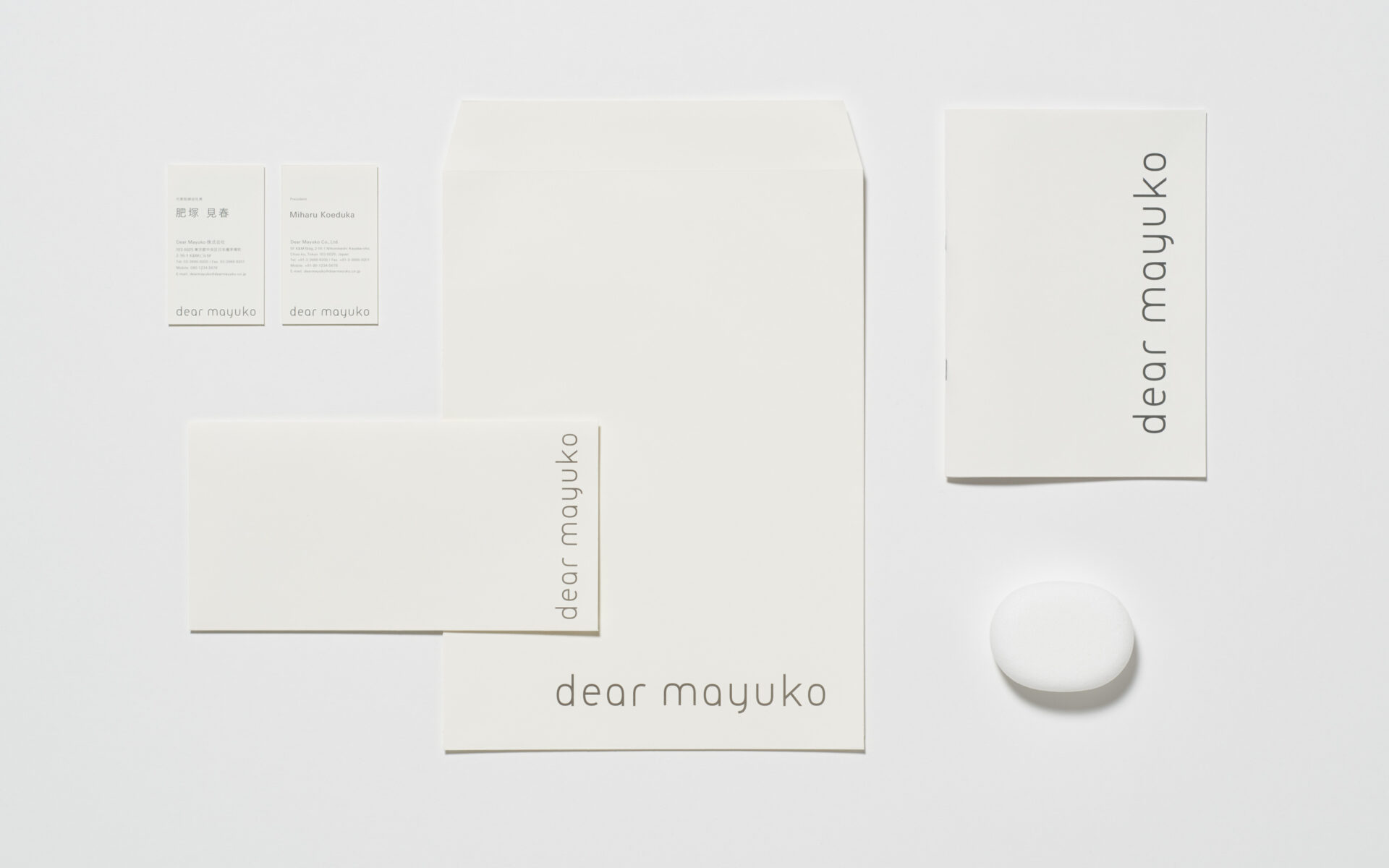
Sales Promotion Tools
Sales promotion tools such as shopping bags, gift boxes, and catalogs use a 125mm x 125mm grid pattern, following the size and look of the tiles on the storefront walls. The grid creates a sharpness that contrasts beautifully with the roundness of the package design.
店頭ツール
紙袋やギフトボックス、カタログなどの店頭ツールには、店舗のタイルと同様のw125h125mmのグリッドパターンを用いています。“まる”をモチーフとしている商品デザインに対して、美しいコントラストをなすようにしています。
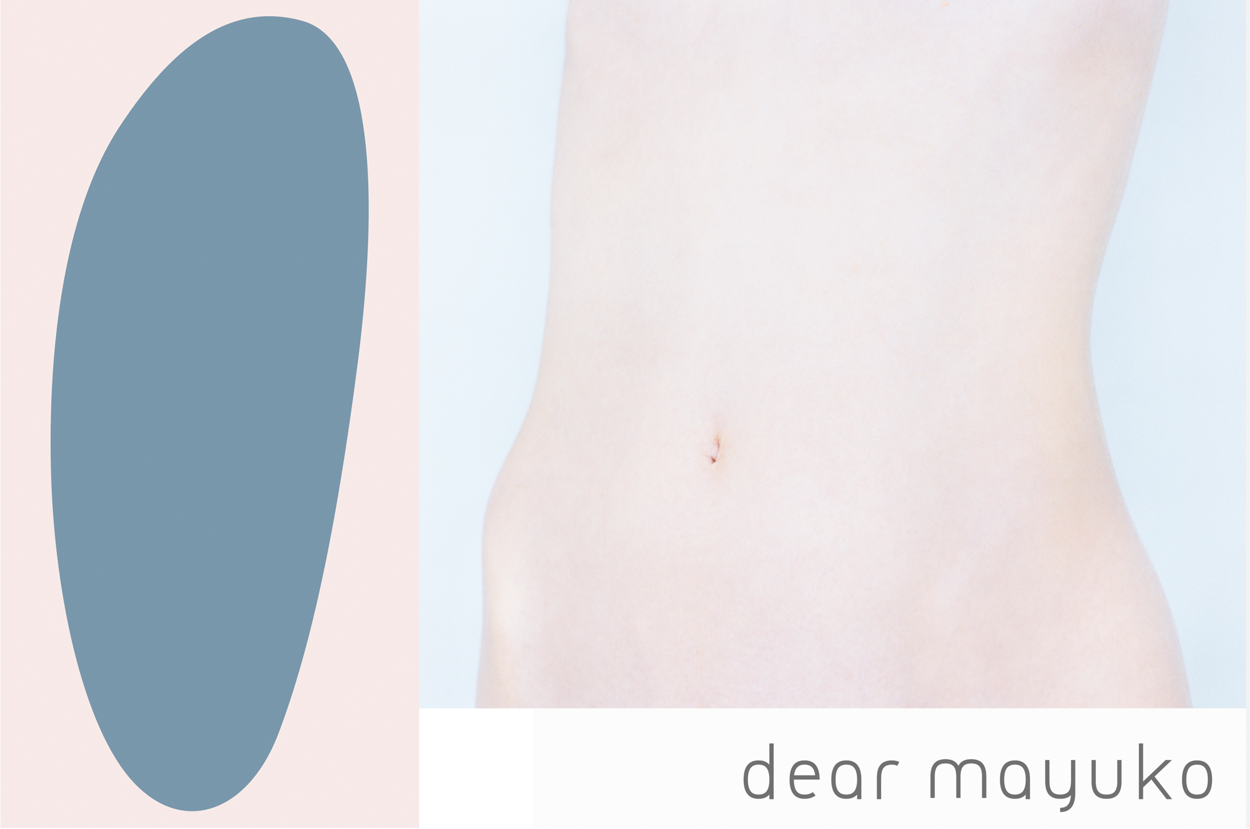
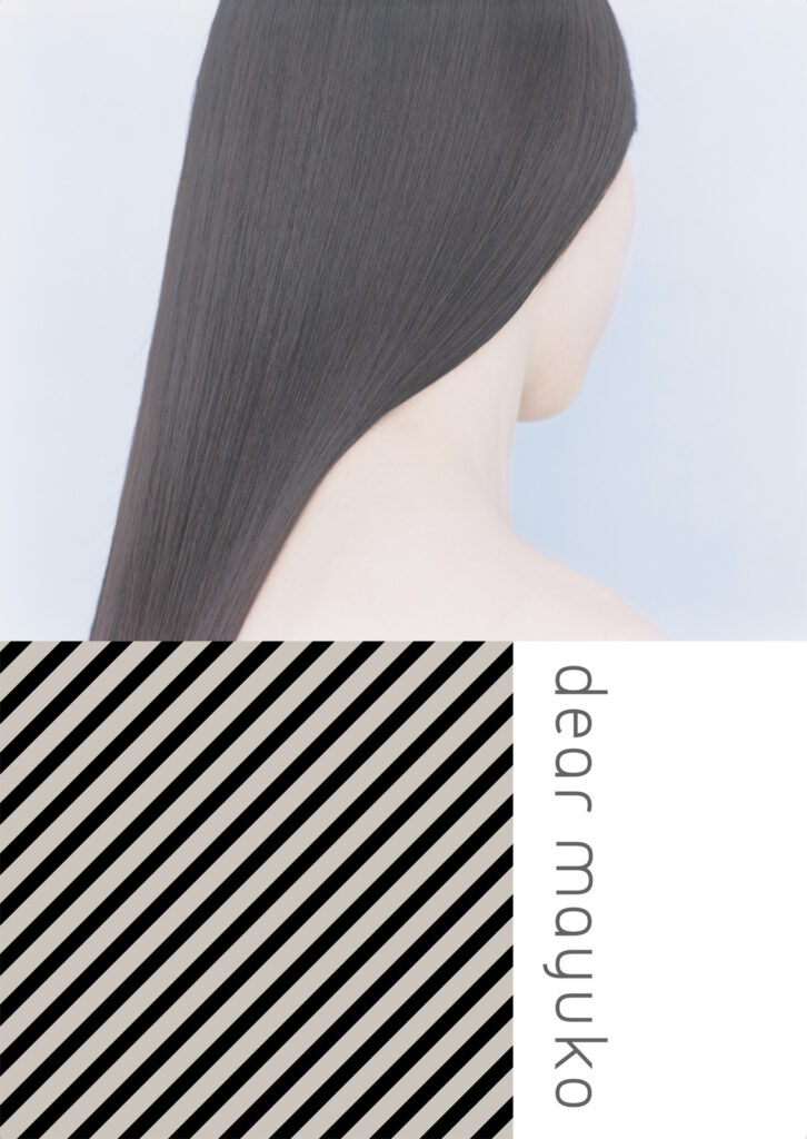
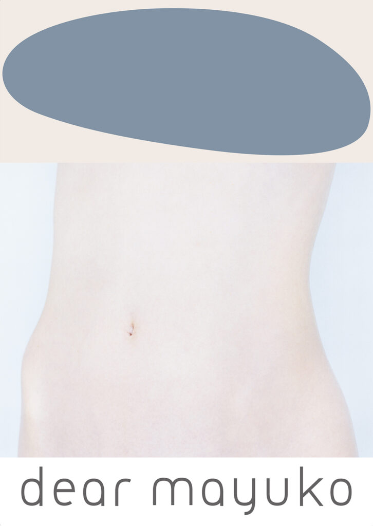
Advertisement
The ethereal, translucent ambience portrayed in the gorgeous photographs and graphics embodies Dear Mayuko’s philosophy of aspiring for pure and beautifully relaxed skin.
広告
イノセントスキン(リラックスした美しい肌)を目指すDear Mayukoならではの世界観を、透明感のある美しい写真とグラフィックを組み合わせることで表現しています。
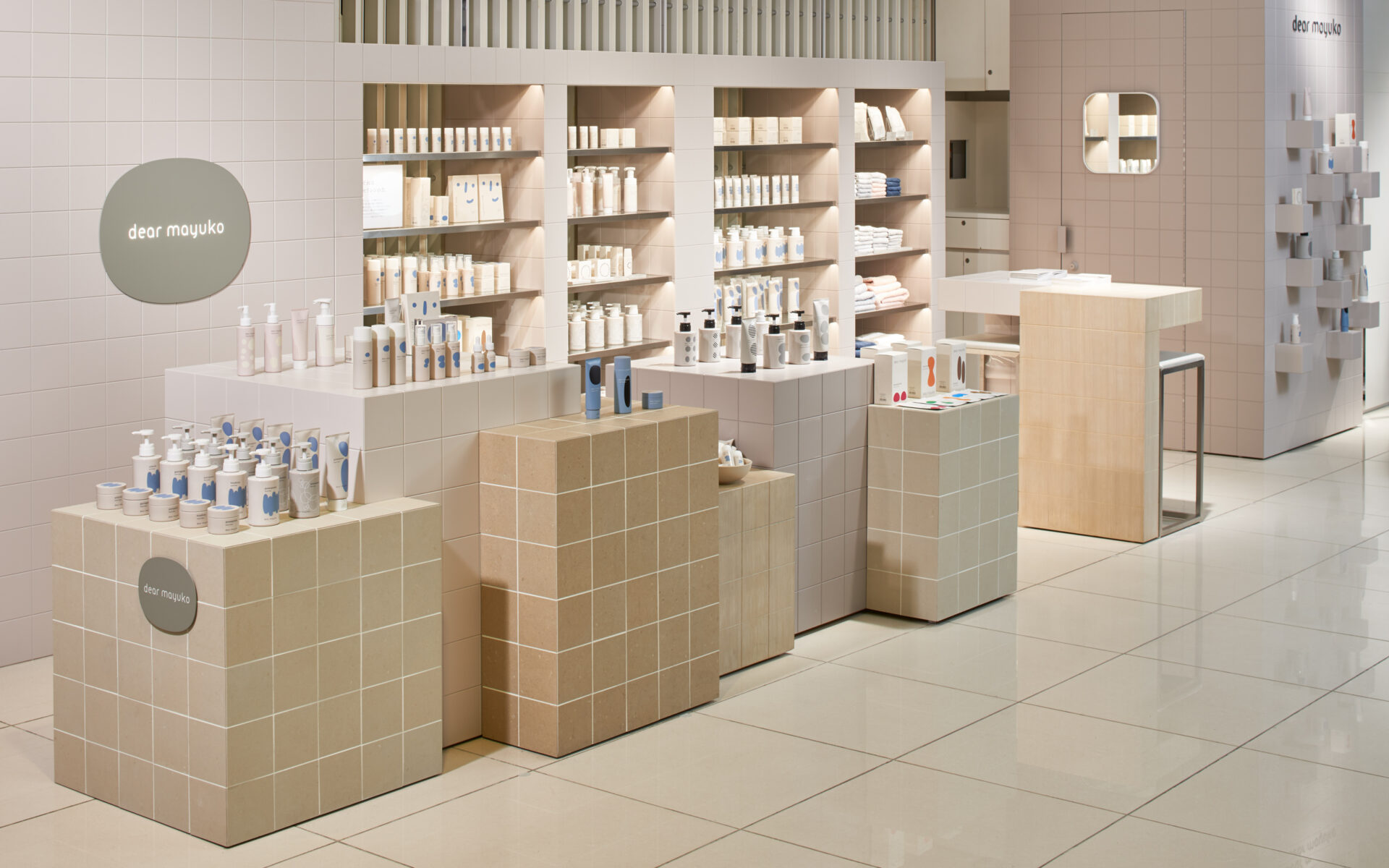
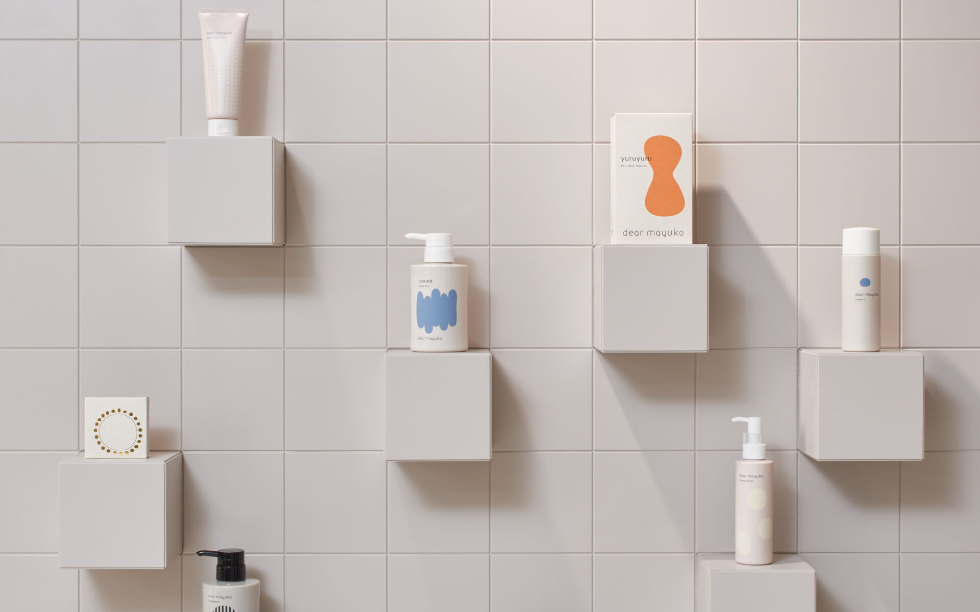
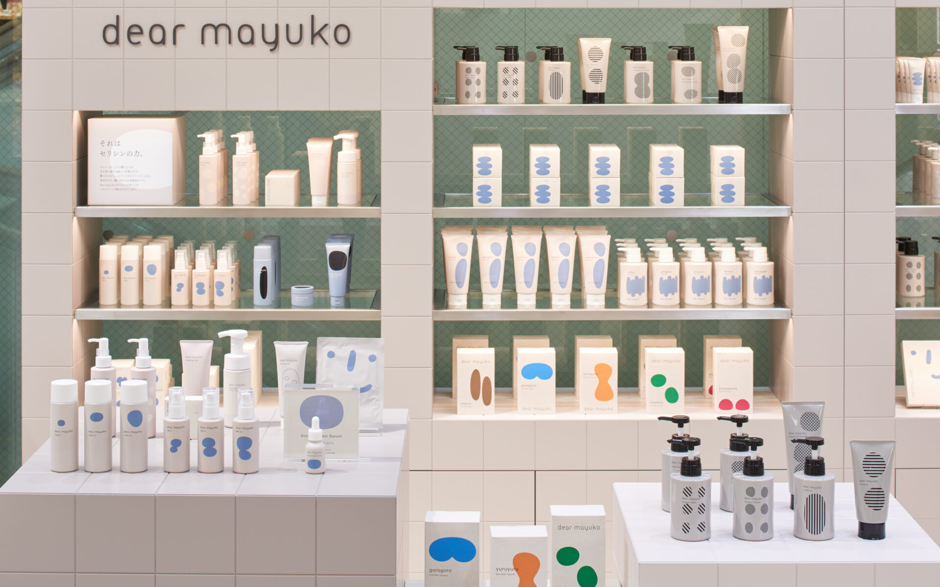
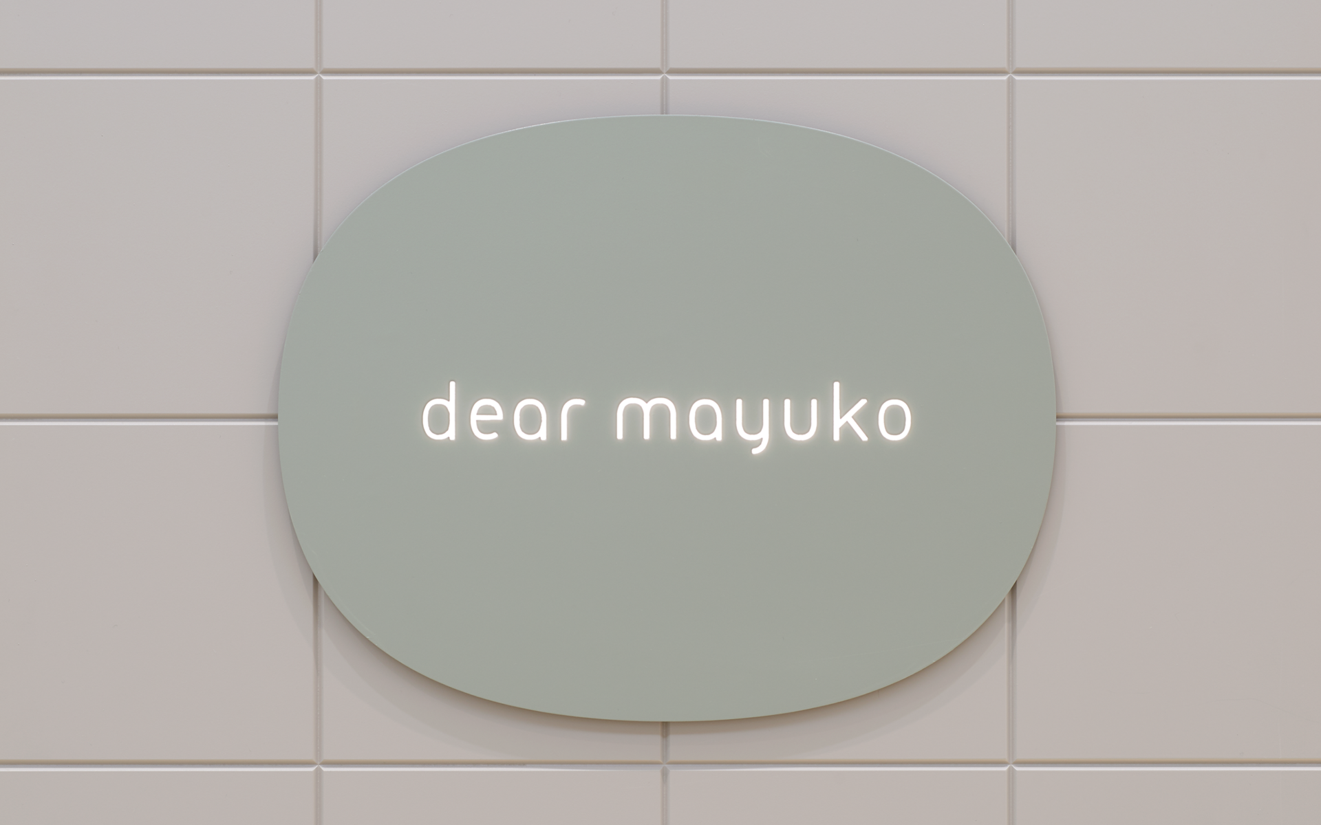
Store Design
The storefront design is reminiscent of a bathroom that restores the mind and body to a pure, innocent state. The walls and fixtures use 125mm x 125mm tiles arranged in a gridded pattern, which provides unity while allowing for the use of various materials, such as ceramic, wood, and urethane.
店舗デザイン
お店のコンセプトは心も体もリセットし無垢な状態になれるお風呂場。壁面・什器にはタイルを採用している。共通するタイルの12.5cmx12.5cmのグリッド模様により統一感がでる仕組みとした。