

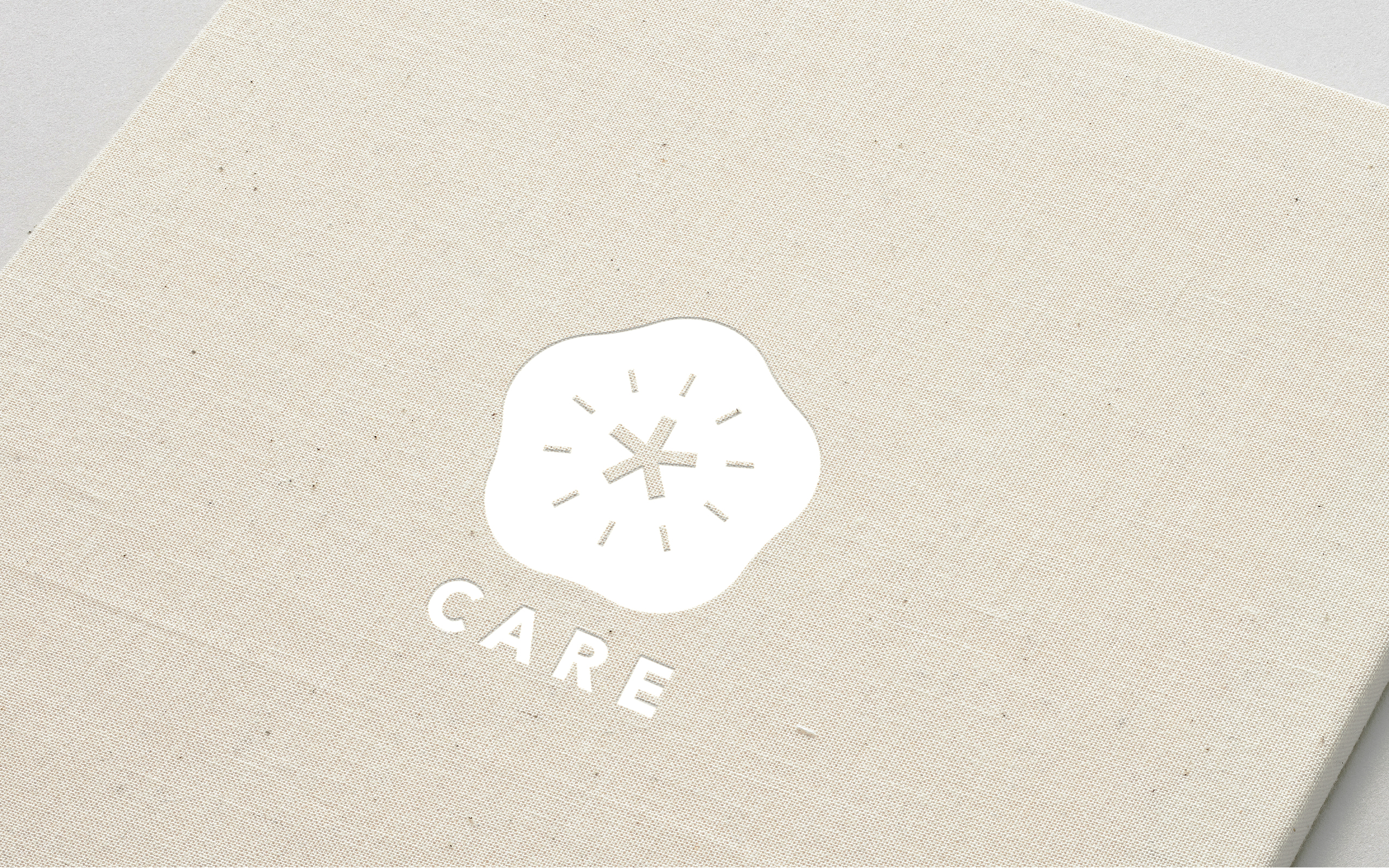
Logo
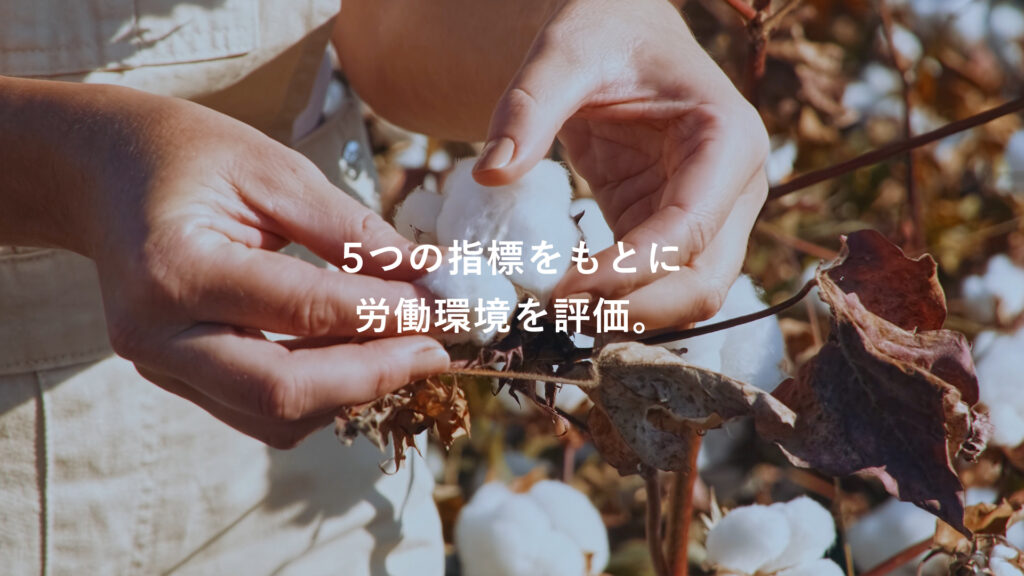
We developed a logo that uses a flower and a person as the main motifs. The five flower petals symbolize different metrics of evaluating working environments. Each petal is a result of rigorous data analysis, comprising 3270 criteria analyzed by aiESG. Focusing on the human-centric program, a human form is placed inside the flower to embrace the connection between the human and social worlds.
ロゴ
「人」と「花」をモチーフとしたロゴは、健全な労働環境がもたらす働きやすい社会を表しています。CARE認証が重視する5つの評価指標を想起させる花の中心に人を配置することで、「人が人を思う証」という、人権にフォーカスしたCARE認証の理念を表現しています。
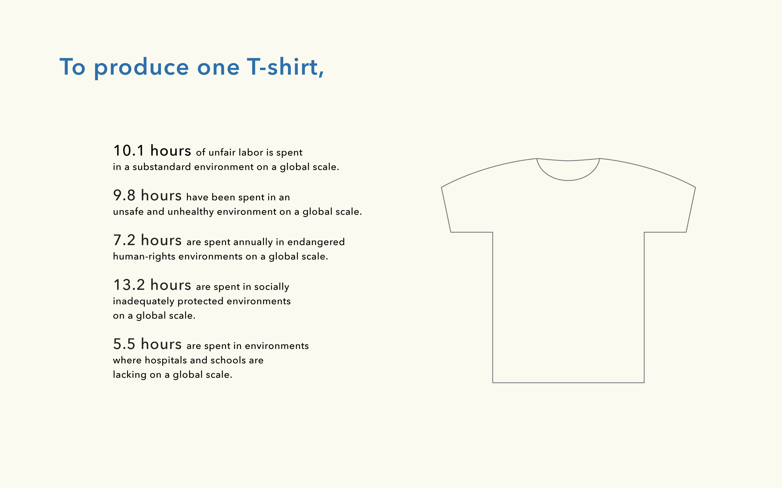


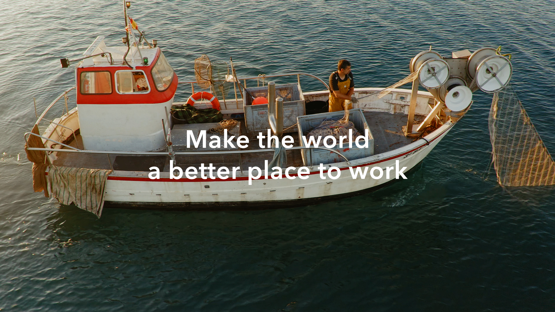
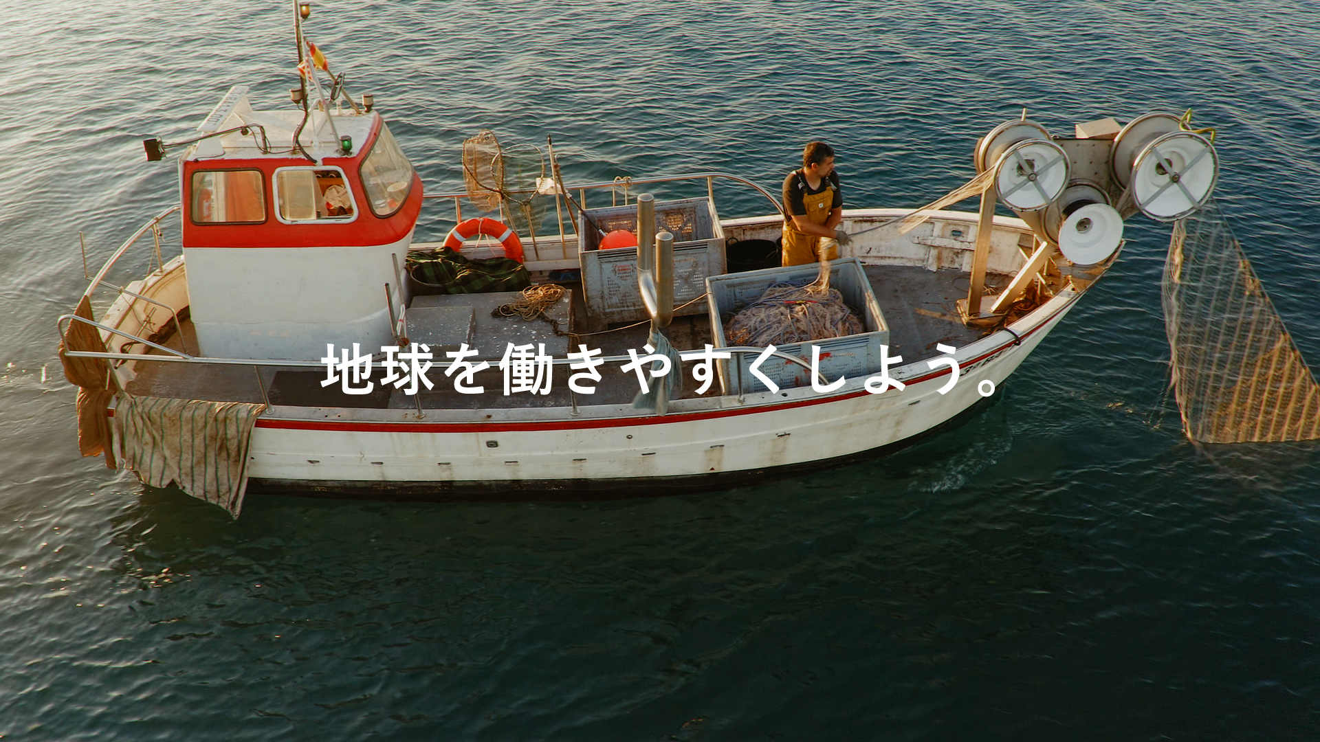
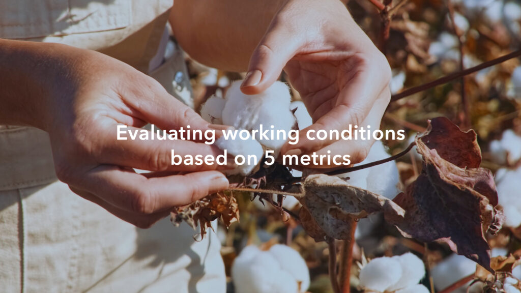
Graphic Elements
We developed various illustrations and animations to show how aiESG’s CARE certification analyzes products and services on a global scale. We developed the tagline “From socks to cities” to highlight the range of the analysis system.
グラフィックエレメント
CARE認証が製品やサービスをグローバルな規模で分析する作法をイラストとアニメーションでわかりやすく説明しています。また、分析システムの幅広さを強調するために「靴下から都市まで」というキャッチフレーズを開発しました。


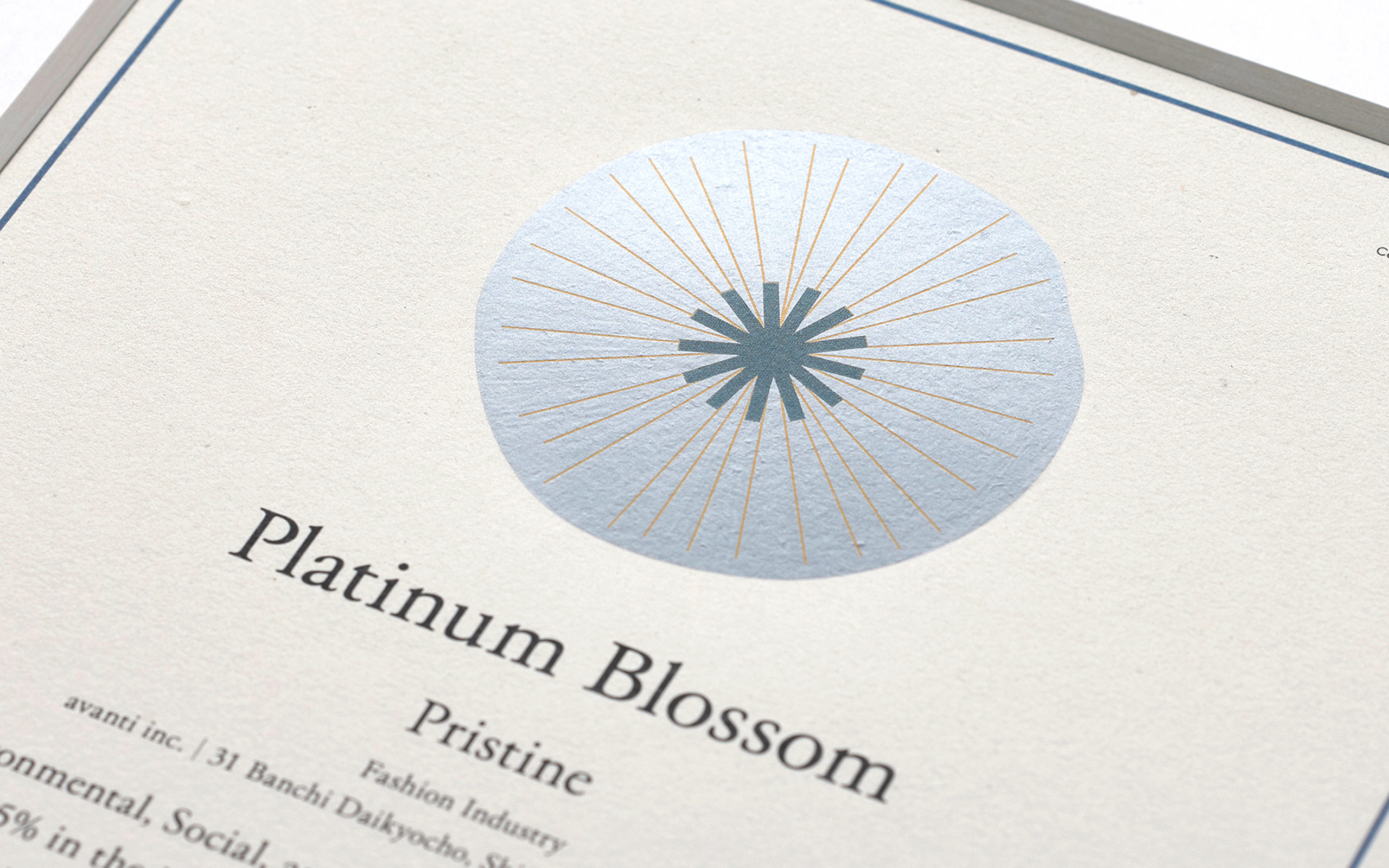
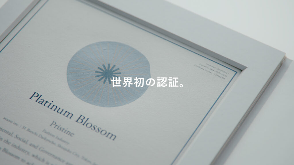
Certificate Design
Companies that meet excellent criteria in aiESG’s ranking system are awarded with the CARE Certificate. We designed the blossom shapes from the data analytics of the service, becoming more circular as the ranking advances from Bronze, to Silver, Gold, and Platinum.
証書のデザイン
優れた基準を満たす企業にはCARE認証の証書が授与されます。証書の中心には評価結果を花として見立てるシステムを考案しています。ランクが「Bronze」、「Silver」、「Gold」、「Platinum」と上がるにつれて、花の形状がより円弧に近づく工夫になっています。証明書はオーガニックコットンペーパーで作られています。


Brand Video
We created a brand video highlighting the need for fair working conditions across the world, and aiESG’s solution through a never-before-developed rating system. Simple and clear visuals are used to show aiESG’s vision.
ブランドムービー
ブランドムービーは公正な労働条件の必要性にaiESGのサービスを明快なビジュアル、モーションフラフィックで説明しています。